Problem Statement
In Tier 2 and Tier 3 cities, users often rely on local vendors or unorganized apps for buying fruits and vegetables. Existing platforms like BigBasket and Blinkit are either too feature-heavy or unavailable in smaller towns. Users need a simpler, trustworthy, and efficient way to order fresh produce online, especially from local farms or sellers, without complicated interfaces or delivery issues.
Competitive Analysis
I analyzed 3 popular apps to understand pain points and best practices:
App | Pros | Cons |
|---|---|---|
BigBasket | Wide variety, strong branding | Overwhelming filters, slow checkout |
Blinkit | 10-min delivery, good UX | Limited fresh produce quality reviews |
UzhavarSandhai (Local App) | Connects local farmers | Outdated design, poor navigation |
Insights gathered:
Users want clarity, trust, and fast checkout.
Visual freshness and simple reordering are key.
Small towns lack organized yet lightweight grocery apps.
My Design Approach (Step-by-Step)
Research & Empathy Mapping
Conducted informal interviews with 4 potential users (including homemakers and bachelors)
Key insight: "We want to know if it’s fresh before buying online."
Persona Creation
Created 2 personas:
MalarVizhi, a 38-year-old homemaker in Trichy
Jeeva, a 28-year-old working professional who orders weekly
User Flow Design
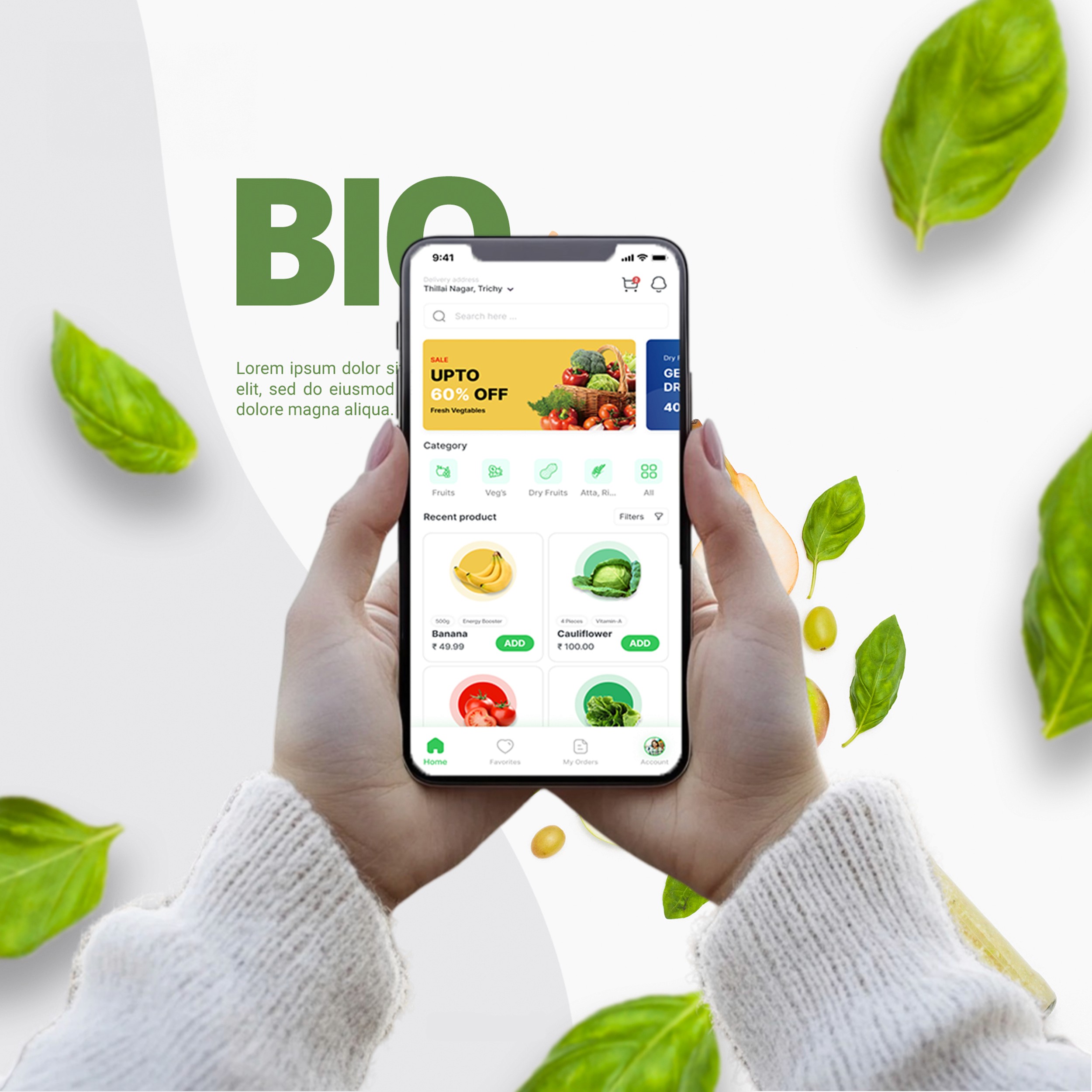
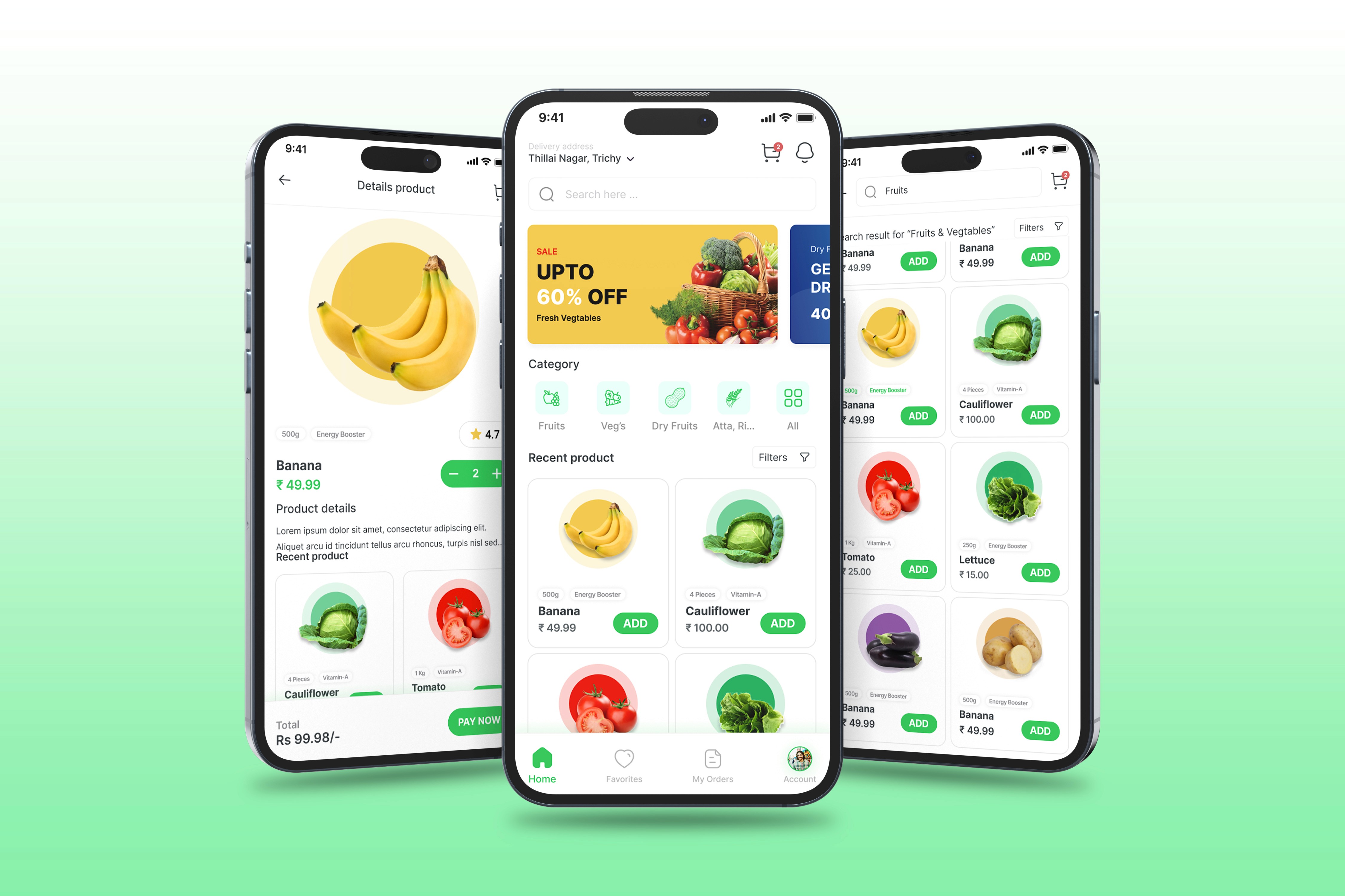
Focused on a linear flow: Home > Product Browse > Cart > Payment
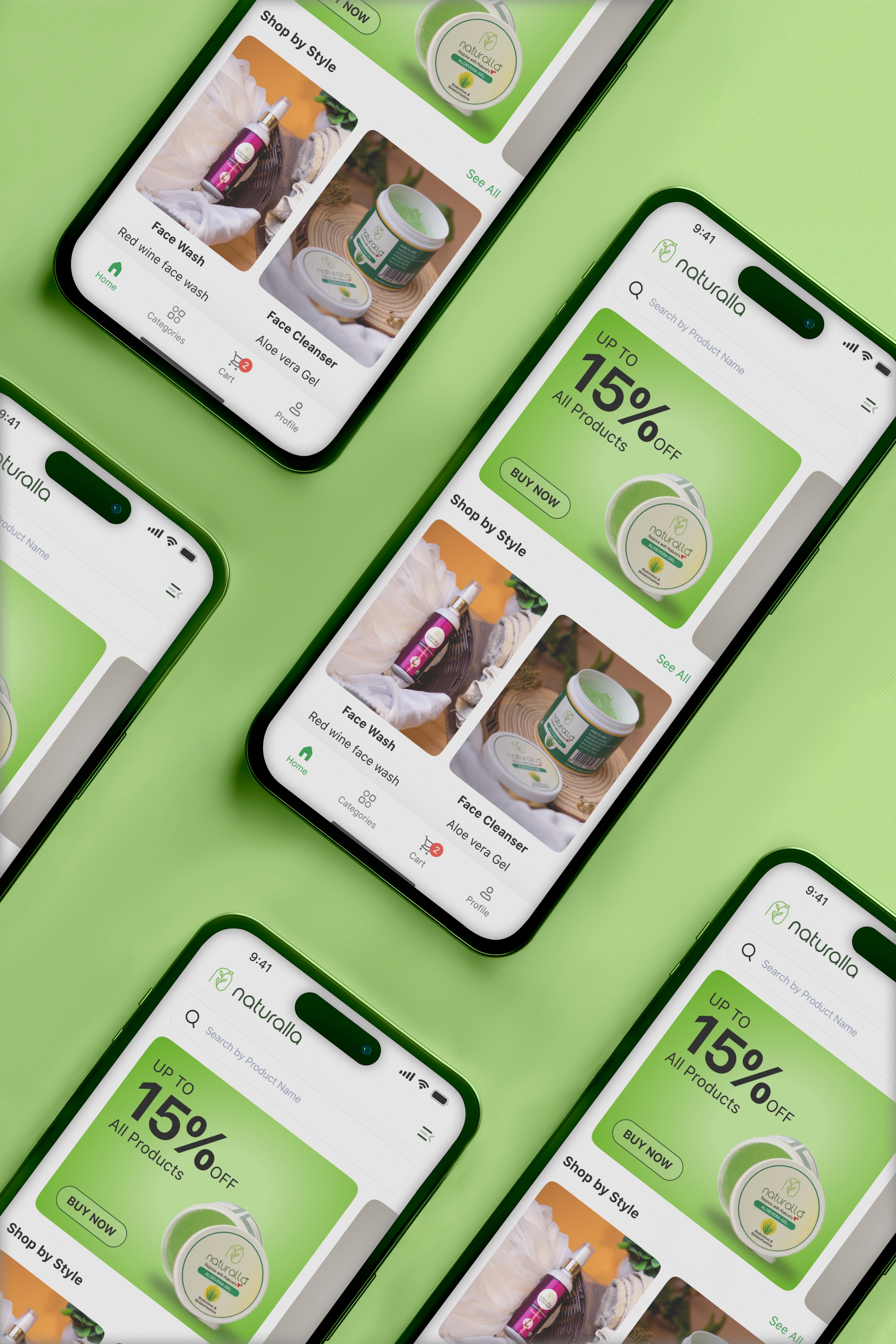
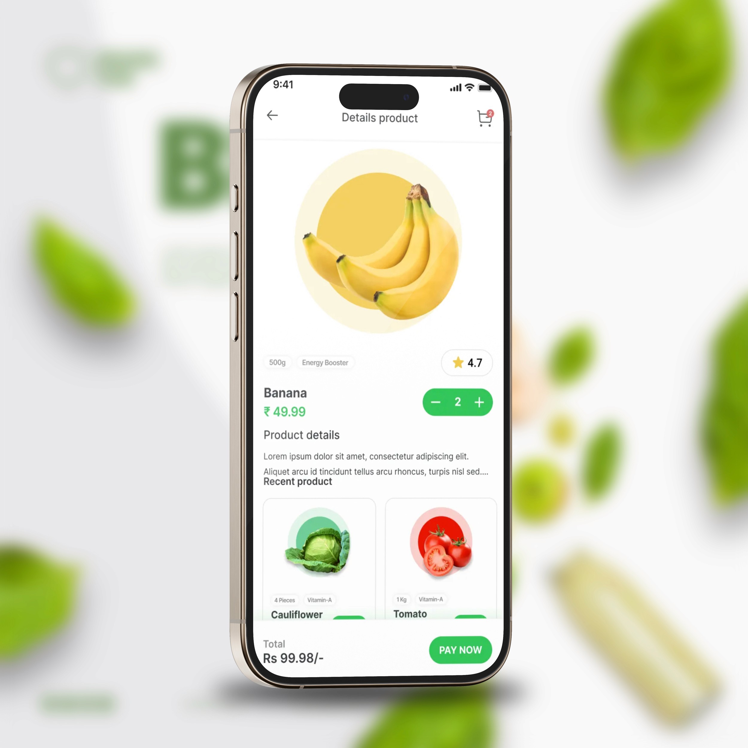
Introduced a “Recent Orders” and “category” section on the homepage
Wireframing (Low-Fidelity)
Sketched 10+ screens on paper and Figma to define layout and flow
Focused on simplifying filter/sort options
UI Design
Created a calming and organic look with green and beige tones
Designed clean product cards with freshness tags
Custom icons and rounded containers to evoke friendliness and trust
Prototype & Usability Testing
Built a clickable prototype in Figma
Tested with 5 users; changes made: larger CTA buttons, simplified address input
Results & Reflection
Delivered a clean, intuitive MVP concept for a grocery app targeted at semi-urban audiences.
Reduced ordering steps to 3-click checkout.
Users appreciated the “Recent Orders” section and the visual freshness indicators.
Learned how simplicity can build trust better than loaded features.