The Challenge
Users were abandoning flight bookings due to complex multi-step processes, unclear pricing, and a poor mobile experience. The existing booking flow had a 23% completion rate, with users dropping off primarily at the payment stage.
Key Pain Points
Identified a complex 7-step booking process causing user fatigue,
Hidden fees appearing at checkout are leading to cart abandonment
Poor mobile experience, with 68% of traffic on mobile devices
Lack of real-time updates is causing booking anxiety
Confusing seat selection and add-on services
Phase 1: Research & Discovery (Duration: 2 weeks)
I conducted 15 in-depth interviews with frequent travelers to understand their pain points
And I analyzed competitor booking flows and identified best practices
Reviewed analytics data to find key drop-off points in the booking process
Created user personas and journey maps to align design with real user behavior
Collaborated with stakeholders through interviews to gather business insights
Phase 2: Strategy & Planning (Duration: 1 week)
Defined a clear and simplified information architecture for the booking experience
Prioritized features based on user research and business objectives
Mapped out user flows to streamline the end-to-end booking process
Established measurable success metrics and KPIs to guide the project
Phase 3: Design & Prototyping (Duration: 2.5 weeks)
Designed low-fidelity wireframes to validate structure and layout
Created high-fidelity UI mockups with a focus on accessibility and brand alignment
Built interactive prototypes for usability testing and stakeholder demos
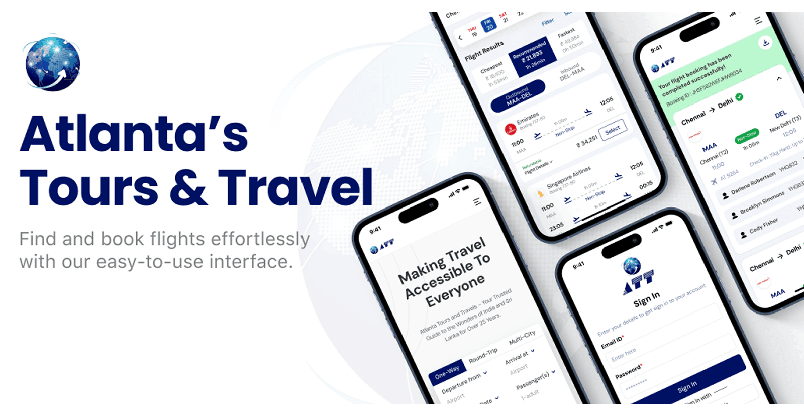
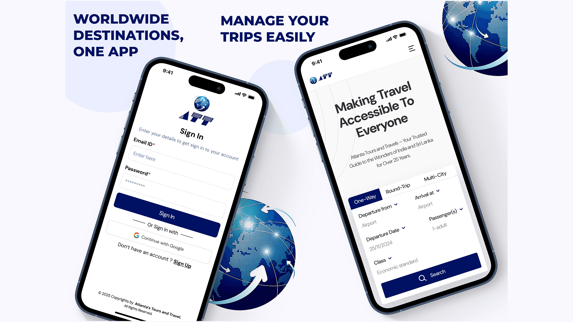
Designed responsive layouts for both mobile and desktop screens
Added micro-interactions and loading states to enhance user experience
Phase 4: Testing & Iteration (Duration: 2 weeks)
Conducted usability testing with 12 users to identify friction points
Ran A/B tests on different pricing display options
Collected feedback from stakeholders and developers
Iterated the design based on test results and feedback
Phase 5: Implementation Support (Duration: 4 weeks)
Worked closely with developers during implementation to ensure pixel-perfect delivery
Provided detailed design specifications and asset exports
Carried out design QA checks throughout the build
Monitored post-launch metrics and gathered user feedback for improvements
Key Solutions & Impact
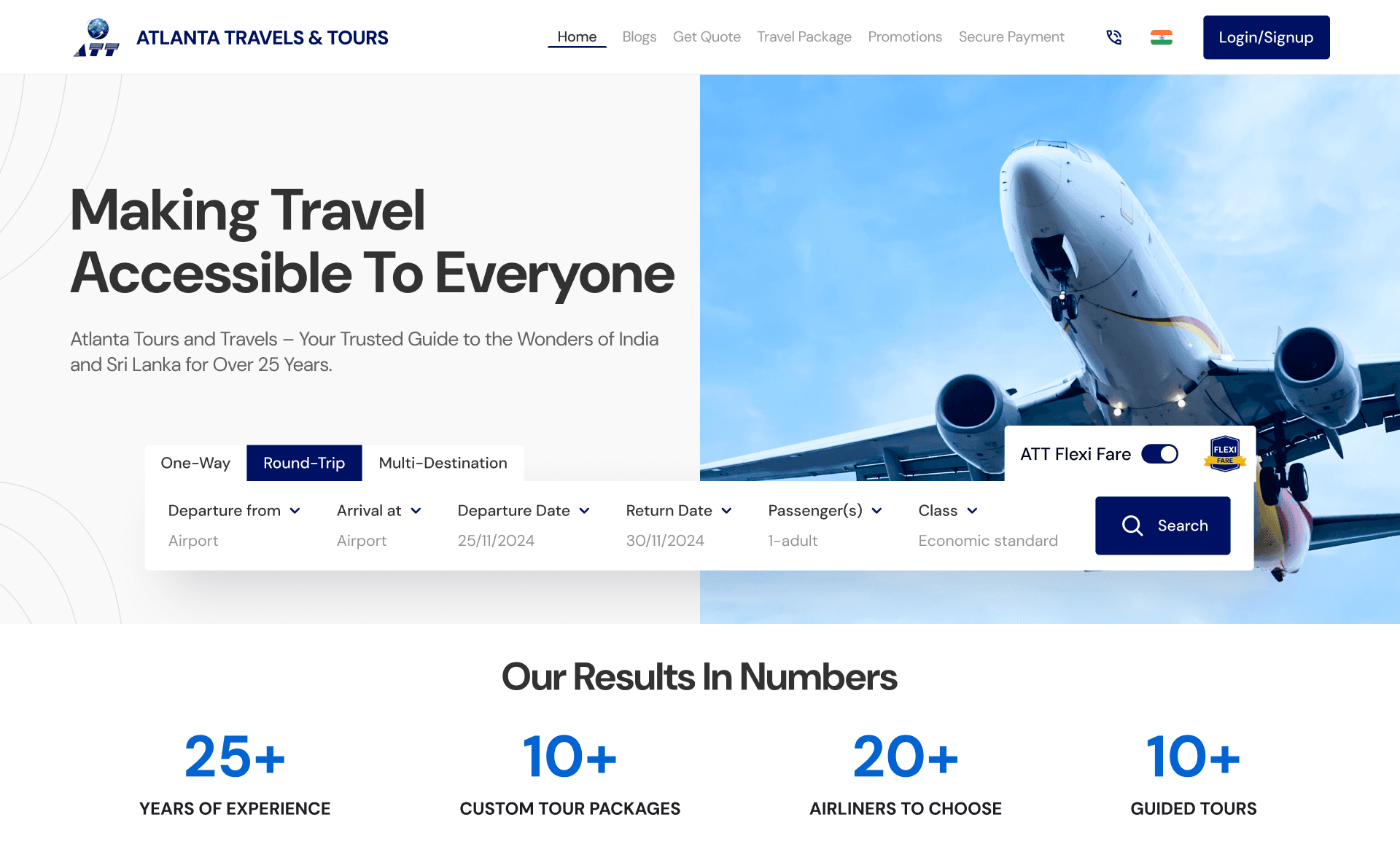
I redesigned the booking experience by implementing a simplified 3-step flow—Search & Select, Passenger Details, and Payment—reducing the original 7-step process. This cut booking time by 45% and increased completion rates to 63%. To build trust, I introduced transparent pricing with a clear fee breakdown, which reduced cart abandonment by 35%. A mobile-first responsive design ensured a seamless experience across devices, boosting mobile conversions by 52%. Additionally, I enhanced the search functionality with predictive suggestions and intuitive filters, improving search success by 38%.
Key Learnings from the Project
This project reinforced the importance of a mobile-first approach, especially in travel booking, where most users prefer quick access on the go. I learned that transparent pricing not only builds trust but also significantly reduces abandonment rates. Providing real-time feedback during the booking process helps reduce user anxiety and improves confidence in their actions. Most importantly, I discovered that simplifying user flows doesn't mean sacrificing functionality—it’s about organizing features more intuitively.
Future Enhancements
To further enhance the user experience, I plan to implement AI-powered price prediction features to help users book at the best time. Introducing social booking options will make it easier for groups to plan and travel together. I also aim to integrate a loyalty program to reward frequent travelers and build customer retention. Additionally, developing personalized travel recommendations based on user behavior and preferences will create a more tailored and engaging booking experience.